
Brand Identity
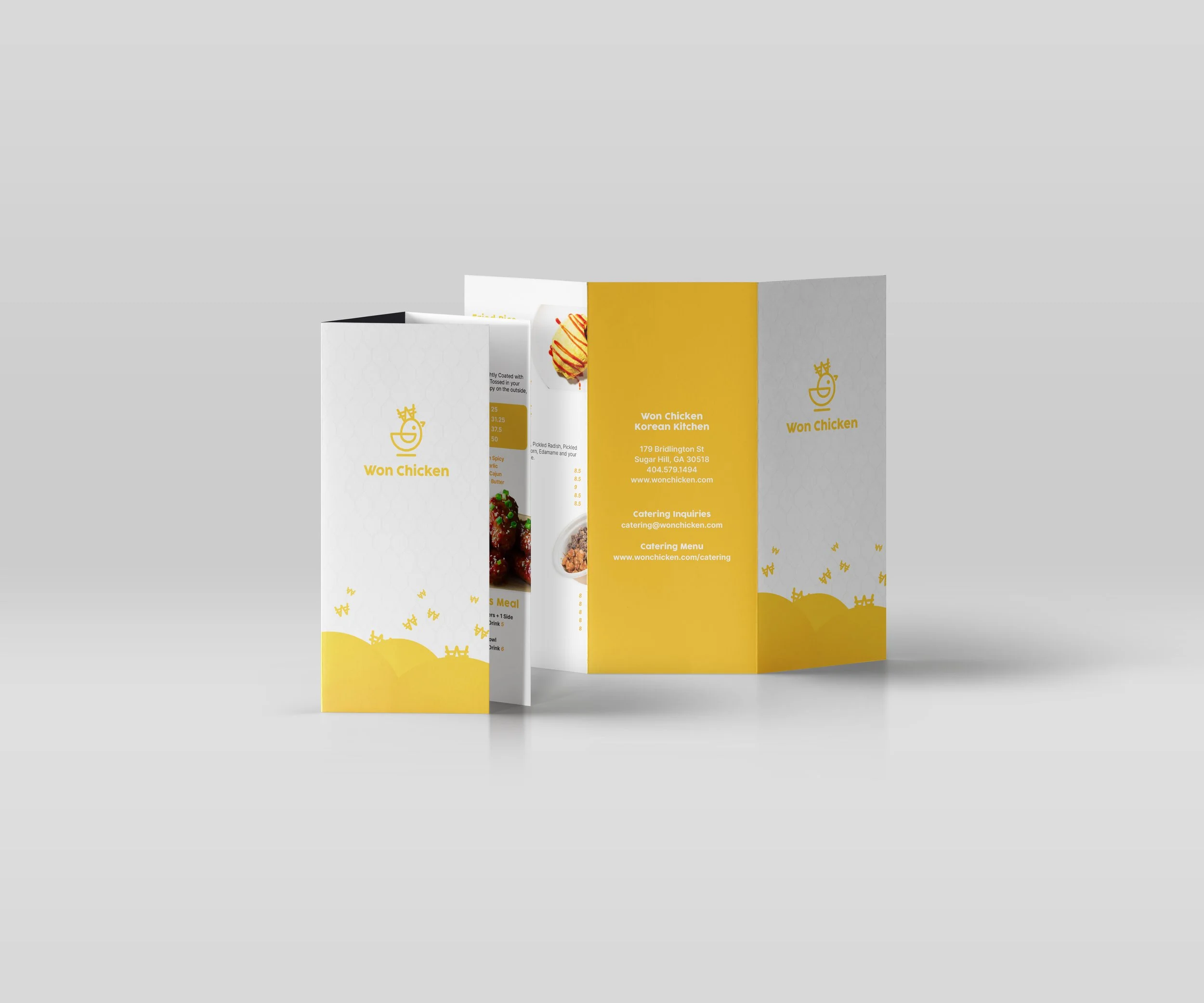
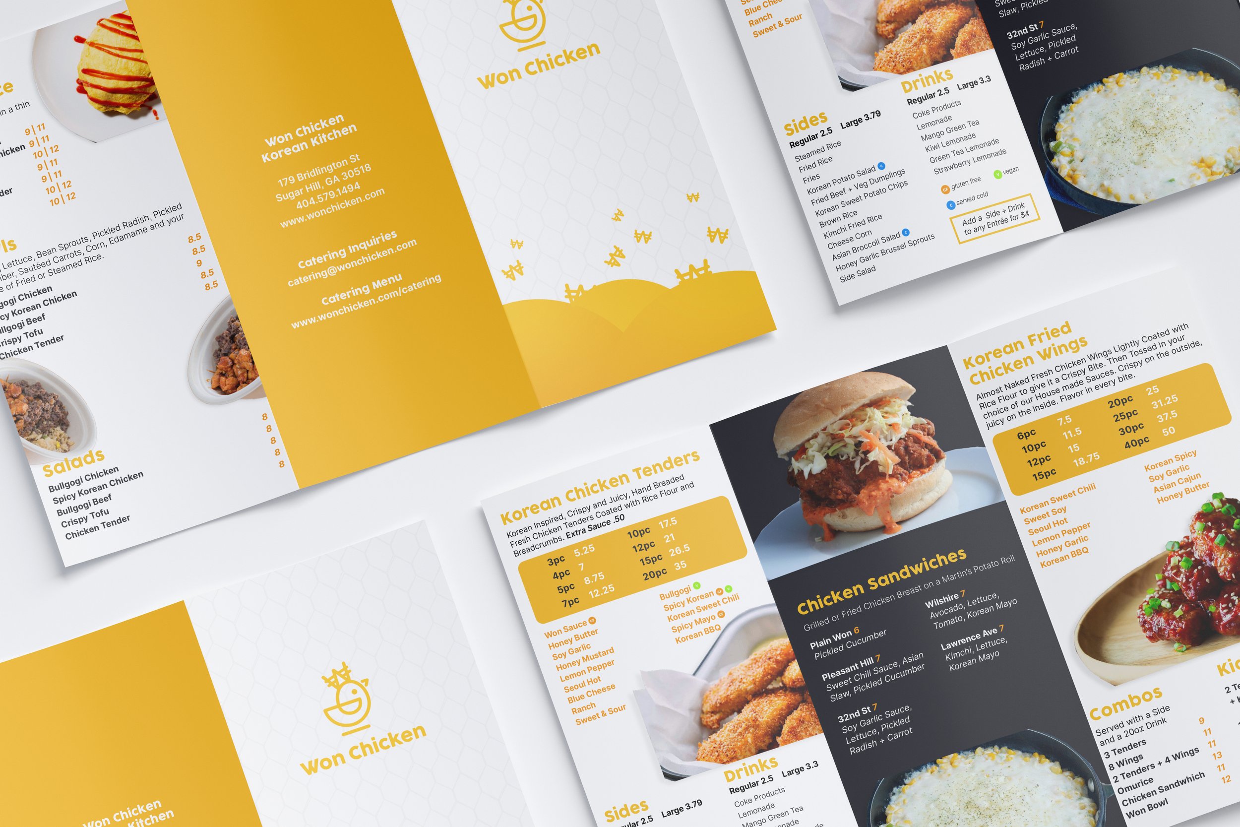
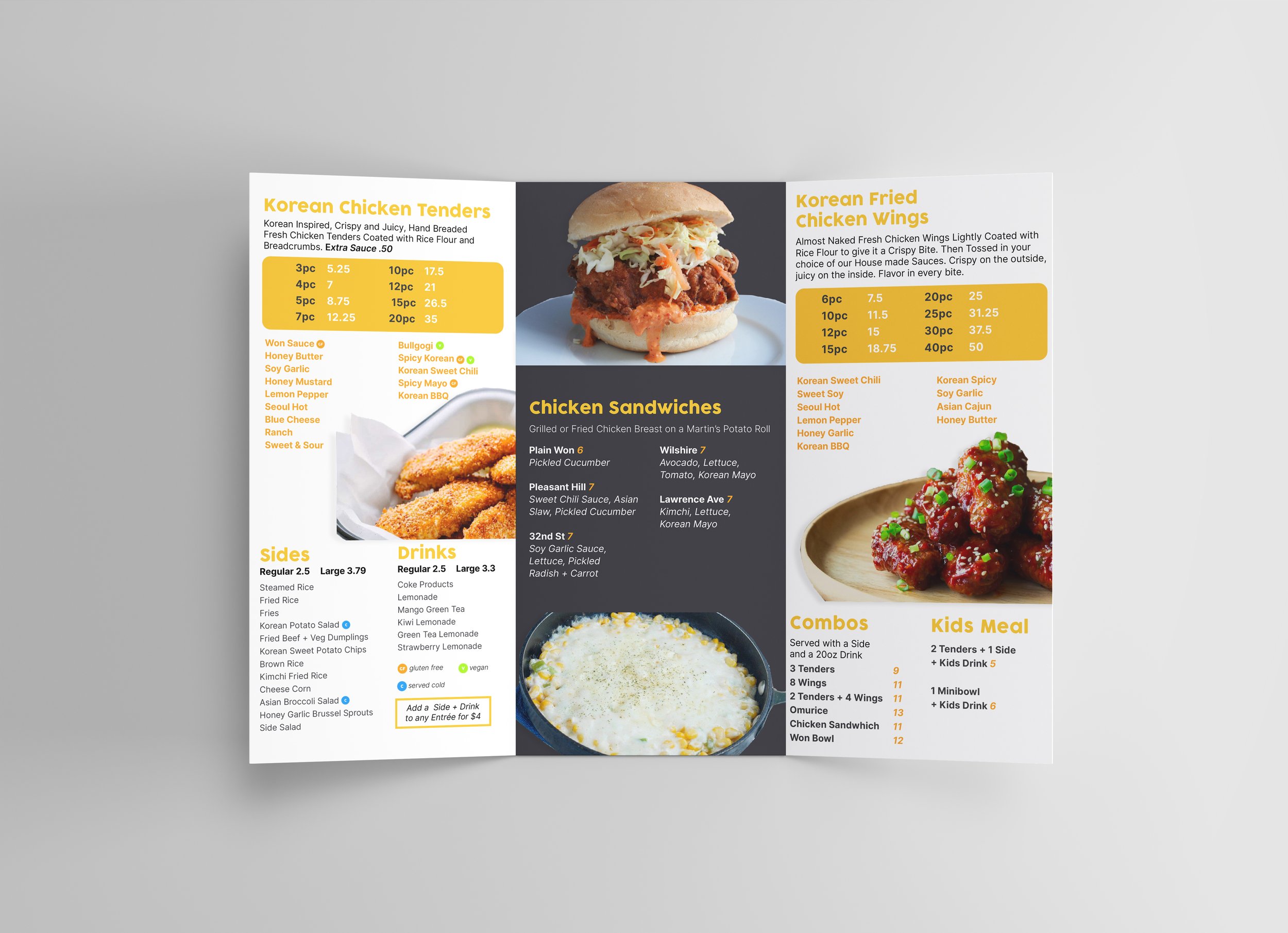
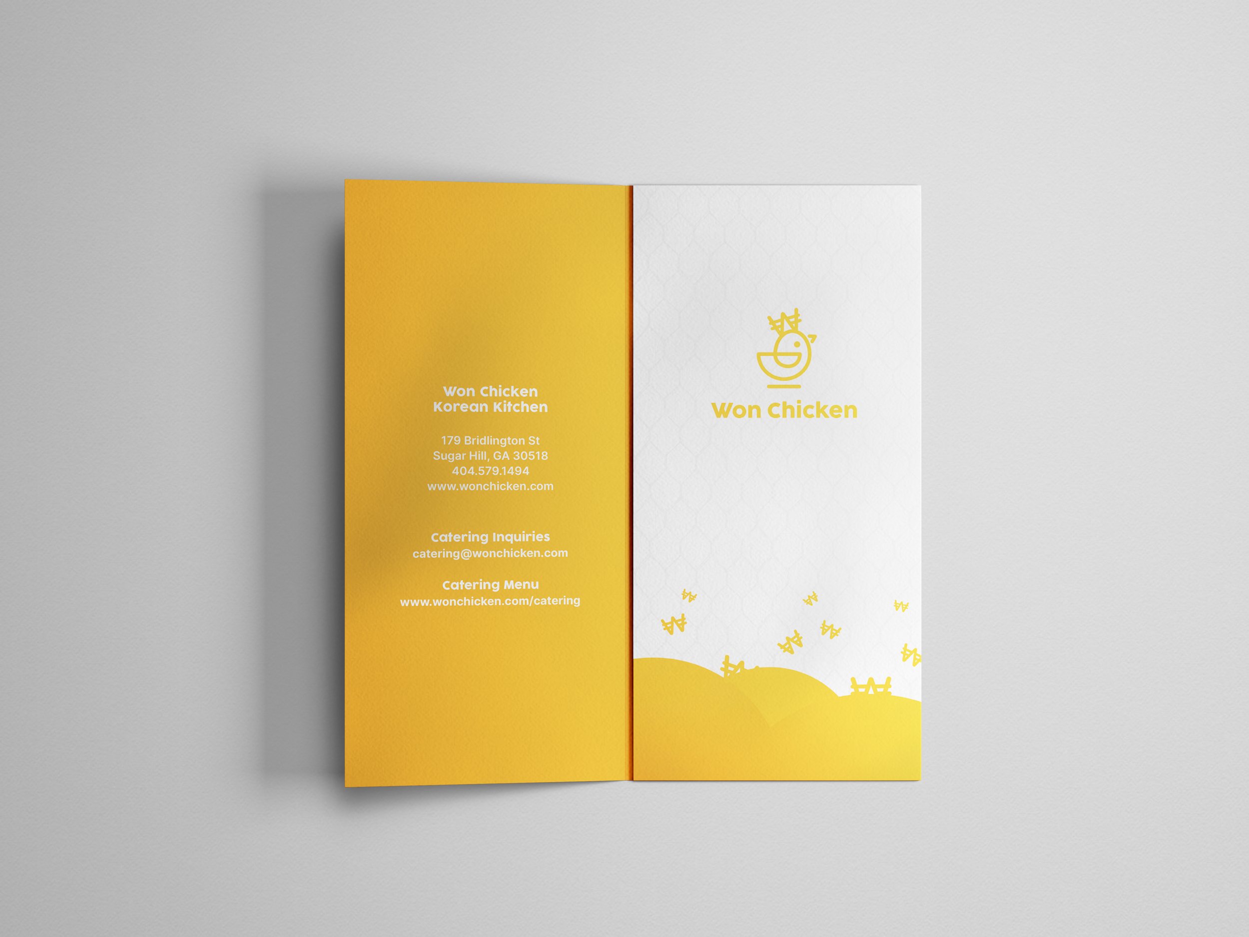
Won Chicken is a chicken concept in Atlanta, GA. The logo was based off of the Korean currency (won). It is a casual restaurant with farm to table fare with a modern take on Korean Fried Chicken. It was never brought fully into fruition, but it was a fun project to work on to build a draft of a menu.
Color Choice
The bright main color was a yellowish-orange color that references the largest bill in Korean Currency. It also provides a space for warmth and playfulness captured in the space.
Imagery
We used full pictures of the offerings to provide a clear image of the fare people would be served and what to expect. There was also a use of wide chicken wire on the front cover to add texture and show the combination of modern and rustic styles.
